Plots
Ready-made Matplotlib views of runs and comparisons. Guide: Plots.
Each picture below is drawn by the function above it on the tea shop from the Walkthrough: one run with an 80% target, and a comparison of the 80% and 95% targets on the same demand.
plot_inventory(
    result: Any,
    sku: Optional[Union[Hashable, List[Hashable]]] = None,
    ax: Optional[Axes] = None,
    figsize: Tuple[float, float] = (12, 5),
) -> Axes
Plot on_hand inventory over time with stockout highlighting.
Parameters:
| Name | Type | Description | Default |
|---|---|---|---|
result
|
Any
|
SimulationResult |
required |
sku
|
Optional[Union[Hashable, List[Hashable]]]
|
One SKU id, or a list of SKU ids summed per period. None sums all SKUs. |
None
|
ax
|
Optional[Axes]
|
Optional matplotlib Axes. |
None
|
figsize
|
Tuple[float, float]
|
Figure size if creating new figure. |
(12, 5)
|
Returns:
| Type | Description |
|---|---|
Axes
|
matplotlib Axes |
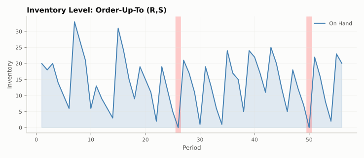
plot_inventory(result, sku="tea_250g"): on-hand stock, with stockout periods shaded
plot_demand_vs_orders(
    result: Any,
    sku: Optional[Union[Hashable, List[Hashable]]] = None,
    ax: Optional[Axes] = None,
    figsize: Tuple[float, float] = (12, 5),
) -> Axes
Plot demand and orders over time.
Parameters:
| Name | Type | Description | Default |
|---|---|---|---|
result
|
Any
|
SimulationResult |
required |
sku
|
Optional[Union[Hashable, List[Hashable]]]
|
One SKU id, or a list of SKU ids summed per period. None sums all SKUs. |
None
|
ax
|
Optional[Axes]
|
Optional matplotlib Axes. |
None
|
figsize
|
Tuple[float, float]
|
Figure size if creating new figure. |
(12, 5)
|
Returns:
| Type | Description |
|---|---|
Axes
|
matplotlib Axes |
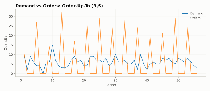
plot_demand_vs_orders(result, sku="tea_250g"): daily demand and the order placed at each review
plot_simulation_dashboard(
    result: Any,
    sku: Optional[Union[Hashable, List[Hashable]]] = None,
    figsize: Tuple[float, float] = (13, 10),
    show_target: bool = True,
) -> ndarray
Multi-panel dashboard for a single simulation run.
Creates a synchronized 4-panel figure
- Inventory position — on_hand with the target level
- Demand and order decisions — demand line with order bars at decision points
- Shortage per period — bar chart of unmet demand
- Cumulative shortage — running total showing impact over time
Panels share the x-axis for easy cross-referencing.
Parameters:
| Name | Type | Description | Default |
|---|---|---|---|
result
|
Any
|
SimulationResult |
required |
sku
|
Optional[Union[Hashable, List[Hashable]]]
|
One SKU id, or a list of SKU ids summed per period. None sums all SKUs. |
None
|
figsize
|
Tuple[float, float]
|
Overall figure size. |
(13, 10)
|
show_target
|
bool
|
Show target inventory level (S) as horizontal reference. |
True
|
Returns:
| Type | Description |
|---|---|
ndarray
|
Array of matplotlib Axes (one per panel). |
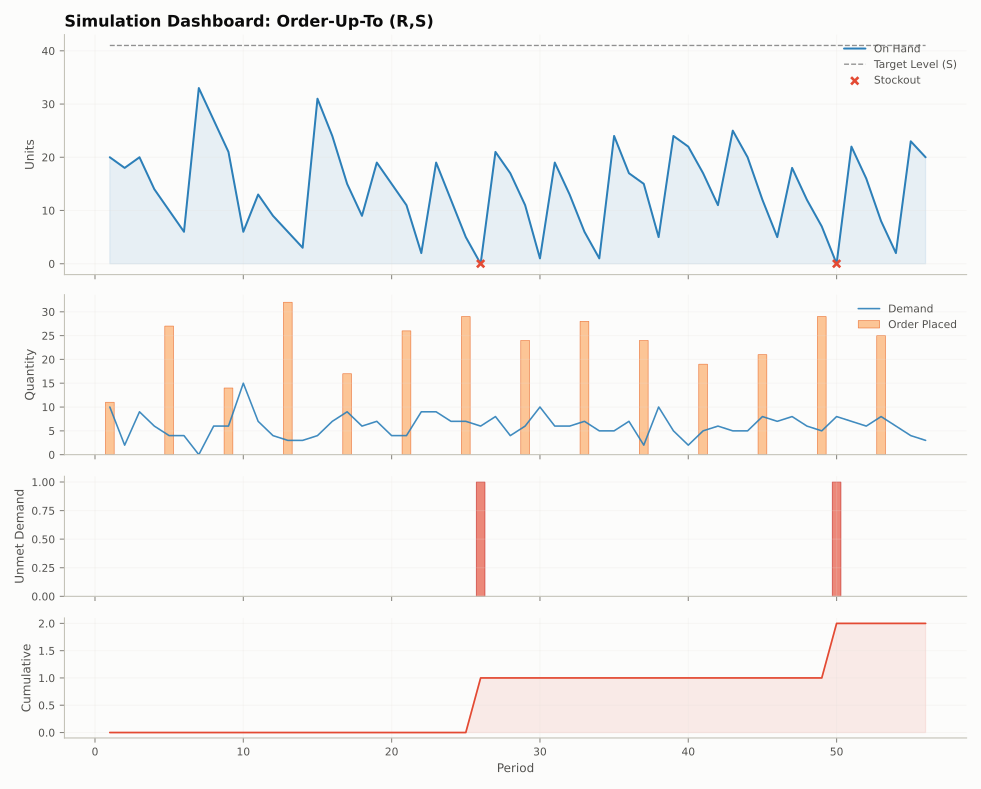
plot_simulation_dashboard(result, sku="tea_250g"): stock with the target level, demand and orders, shortage, and cumulative shortage
plot_comparison(
    comparison_result: Any,
    metric: str = "on_hand",
    sku: Optional[Union[Hashable, List[Hashable]]] = None,
    ax: Optional[Axes] = None,
    figsize: Tuple[float, float] = (12, 6),
) -> Axes
Overlay a metric across multiple policies from a ComparisonResult.
Parameters:
| Name | Type | Description | Default |
|---|---|---|---|
comparison_result
|
Any
|
ComparisonResult |
required |
metric
|
str
|
Column name from history to plot (default: 'on_hand'). |
'on_hand'
|
sku
|
Optional[Union[Hashable, List[Hashable]]]
|
One SKU id, or a list of SKU ids summed per period. None sums all SKUs. |
None
|
ax
|
Optional[Axes]
|
Optional matplotlib Axes. |
None
|
figsize
|
Tuple[float, float]
|
Figure size if creating new figure. |
(12, 6)
|
Returns:
| Type | Description |
|---|---|
Axes
|
matplotlib Axes |
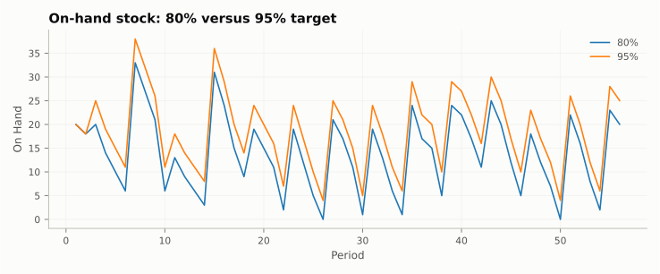
plot_comparison(comparison, metric="on_hand", sku="tea_250g", ax=ax), with a title set on ax
plot_summary_comparison(
    comparison_result: Any,
    metrics: Optional[List[str]] = None,
    figsize: Tuple[float, float] = (10, 6),
) -> Axes
Grouped bar chart comparing summary metrics across policies.
Parameters:
| Name | Type | Description | Default |
|---|---|---|---|
comparison_result
|
Any
|
ComparisonResult |
required |
metrics
|
Optional[List[str]]
|
List of metric names to plot. None = all numeric metrics. |
None
|
figsize
|
Tuple[float, float]
|
Figure size. |
(10, 6)
|
Returns:
| Type | Description |
|---|---|
Axes
|
matplotlib Axes |
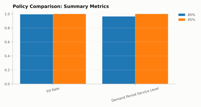
plot_summary_comparison(comparison, metrics=["fill_rate", "demand_period_service_level"]), with the legend moved outside
plot_comparison_dashboard(
    comparison_result: Any,
    sku: Optional[Union[Hashable, List[Hashable]]] = None,
    figsize: Tuple[float, float] = (13, 8),
) -> ndarray
Side-by-side multi-metric comparison across policies.
Creates a 3-panel figure
- Inventory levels overlaid per policy
- Cumulative shortage per policy
- Fill rate evolution over time per policy
Parameters:
| Name | Type | Description | Default |
|---|---|---|---|
comparison_result
|
Any
|
ComparisonResult |
required |
sku
|
Optional[Union[Hashable, List[Hashable]]]
|
One SKU id, or a list of SKU ids summed per period. None sums all SKUs. |
None
|
figsize
|
Tuple[float, float]
|
Overall figure size. |
(13, 8)
|
Returns:
| Type | Description |
|---|---|
ndarray
|
Array of matplotlib Axes. |
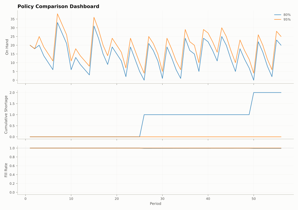
plot_comparison_dashboard(comparison, sku="tea_250g"): stock, cumulative shortage, and fill rate over time