Plots
stockcast.visualization draws common views of a run from its event table. Every function returns Matplotlib axes, so you can restyle,
annotate, or combine them, and none of them calls plt.show() for you.
One run
Setup: the tea shop from the Walkthrough
import numpy as np
import pandas as pd

from stockcast.core import InventoryStateDataFrame, SimulationEngine
from stockcast.policies import OrderUpToPolicy
from stockcast.utils import DemandGenerator

sku = "tea_250g"
opening_date = pd.Timestamp("2026-01-05")
lead_time, review_period = 2, 4
horizon = lead_time + review_period

demand = DemandGenerator(
    [sku], first_date=opening_date + pd.Timedelta(days=1), freq="D",
    random_seed=3, negative_demand_handling="clip_zero",
).seasonal(n_periods=56, base=6.0, amplitude=2.0, season_length=7, std=2.0)
demand["y"] = demand["y"].round()

inventory = InventoryStateDataFrame.from_observed(
    pd.DataFrame({"unique_id": [sku], "date": [opening_date], "on_hand": [30.0]}),
    allow_backorders=False,   # some pages step this state by hand
)

paths = np.random.default_rng(42).poisson(6.0, size=(10_000, horizon))


def tea_policy(probability):
    """Order-up-to policy whose target is the given quantile of 6-day demand."""
    target = pd.DataFrame({
        "unique_id": [sku],
        "target": [np.quantile(paths.sum(axis=1), probability)],
        "date": [opening_date + pd.Timedelta(days=horizon)],   # the last day it covers
    })
    return OrderUpToPolicy(
        lead_time=lead_time, review_period=review_period, freq="D",
        service_level=probability, allow_backorders=False,
    ).fit(target, target_column="target")


policy = tea_policy(0.95)
run_settings = dict(random_seed=3)
result = SimulationEngine().run(
    policy=policy, demand_source=demand, inventory=inventory, **run_settings,
)
import matplotlib.pyplot as plt

from stockcast.visualization import plot_simulation_dashboard

axes = plot_simulation_dashboard(result, sku=sku, figsize=(10, 8))
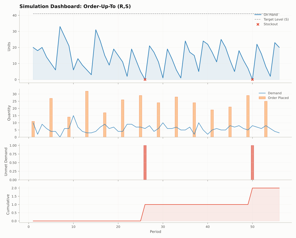
The dashboard stacks four panels that share the time axis: stock on hand with the target level, demand with the orders placed, shortage per period, and cumulative shortage. (This picture uses the 80% target, which shows a couple of small stockouts.)
| Function | Draws |
|---|---|
plot_inventory(result, sku=None, ax=None) |
on-hand stock over time, with stockout periods highlighted |
plot_demand_vs_orders(result, sku=None, ax=None) |
demand and order quantities |
plot_simulation_dashboard(result, sku=None, show_target=True) |
the four-panel dashboard above |
sku selects one SKU, or a list of SKUs added together per period; None
adds all SKUs together. A tuple such as ("tea", "shop1") is one SKU id.
Several runs
For a ComparisonResult from run_comparison:
| Function | Draws |
|---|---|
plot_comparison(comparison, metric="on_hand", sku=None, ax=None) |
one line per policy for a state column |
plot_summary_comparison(comparison, metrics=None) |
grouped bars of summary() metrics |
plot_comparison_dashboard(comparison, sku=None) |
a multi-panel side-by-side comparison |
from stockcast.core import SimulationEngine
from stockcast.visualization import plot_comparison, plot_summary_comparison

comparison = SimulationEngine().run_comparison(
    policies=[tea_policy(0.8), tea_policy(0.95)], labels=["80%", "95%"],
    demand_source=demand, inventory=inventory, **run_settings,
)
fig, ax = plt.subplots(figsize=(9, 3))
plot_comparison(comparison, metric="on_hand", sku=sku, ax=ax)
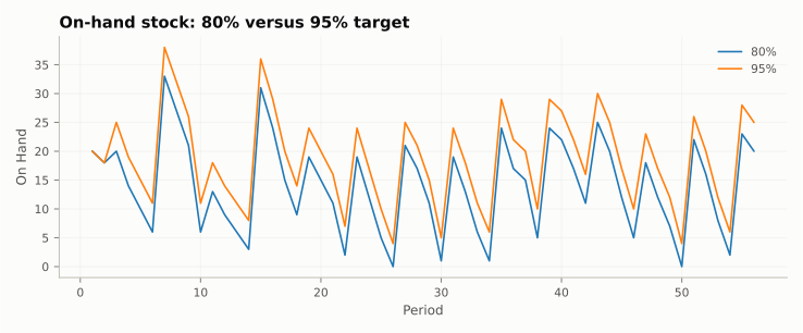
ax.set_title("On-hand stock: 80% versus 95% target")
Custom charts
The event table is a tidy DataFrame, so any plotting library works directly on
result.to_event_frame(). The figures throughout these docs are drawn that
way; their source is in
docs/scripts/make_figures.py.
See also: API: plots · Notebook 02 · Notebook 06